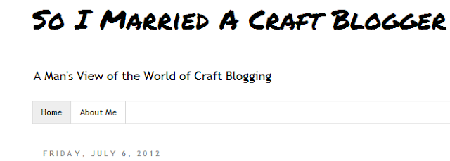
Apparently I've been guilty of a major blog faux pau, the equivalent of wearing a headband. [Side note: I wore a headband three times this week. Once to mow the lawn, and twice in public helping people move. It got a lot of positive compliments. Someone asked if I was trying to make a statement. I am. The statement is "I like to keep sweat out of my eyes."]
Frankly, I've been thinking about a new header for a while now and artsy thoughts have been swirling around in my head. I finally had some time to sit down and Photoshop one out. First off, it's been a long time since I've used Photoshop and it threw me off for a while. I kept trying to use keyboard commands and shortcuts from AutoCAD and PowerPoint. I finally gave up and had Mandy give me a three minute tutorial. It was a bit humbling [and irritating], since I've always been "tech support" in our house.
Mandy: "You can copy with control C..."
Me, cutting her off: "I know about control C. It's not working."
Mandy: "You need to select what you want to copy."
Me: "Look, I am selecting it. It's not working."
Mandy: "You have to be on the active layer. Click in the lower right..."
Me, cutting her off again: "I know how to get to the active layer." [grumble, grumble...because she's right]
I started with the plain and simple, black and white version I concocted, but I've heard that it's a bit drab and needs color and a snazzier font. Mandy snuck on the computer in the middle of my Photoshop session and made a few tweaks. Her version is below. Note all the manly colors. And hearts. Nine hearts, to be exact. The font for "craft blogger" is also hers. I don't know why Arial isn't fancy enough for her. I even made it Arial Black, for emphasis. Thoughts from the crowd and the two versions below compared with the one up top?
In addition to having a text only header, I've also been accused of having too plain of a background. Guilty as charged. Don't worry, I'm working on a tangerine tango and turquoise chevron background right now. It's going to be epic.
Side note: I was trying to think of a simple way to communicate the difference between men and women and restroom signs came to mind. If you Google Image Search "restroom signs", there's some pretty funny stuff out there.


My opinion (for what it's worth) is that your header should be a combo of all three. I like the all black and white one as a basis, but I like the all blue woman that is in your current header, and I like the font for "Craft Blogger" from the header with all the colors. Can't wait for the chevron background!!!
ReplyDeleteI dont mind the art but I liked your old font.
ReplyDeleteI love Mandy and her site but I think the emphasis on your header should be the guy side rather than the "craft blogger" and the girly craft stuff at the bottom. I do like the blue woman but I think the items should be like a saw, a square, a ladder... And the emphasis should be the word "Married" not the craft blogger part. The chevron background sounds appropriate, lol. Maybe the question mark in red? :)
ReplyDeleteI prefer your header as it is currently, not too many colors.
ReplyDeletesince this is from 'the other side" how about keeping the uncluttered theme. this is NOT the craft blogger you are married to's blog, let's let it look like it.
ReplyDeleteLove it just like it is now!
ReplyDeleteJeannine @ The Concrete Cottage
Yep, I think the one you have now fits you. :) And the white background fits too. Definitely looks like a man's blog. Which it is... right... :)
ReplyDeleteTrevor, as the husband of a mommy blogger myself, I feel your pain! My wife showed me your blog and I find it hilarious. The comments above just add to the hilarity. Dude, I can't wait to see more! Thanks.
ReplyDeleteJeff
bahahah!! i just found your blog...i love it! as a crafty blogger myself i'm keen to know what my husband would write about if he had his own blog! i like the new header...and i even like the alternative colour one...but chevron!! now that's heading into crafty daddy blogger territory!!!
ReplyDelete